
“He ran better than he finished” is one of those things you hear and don’t think too much about.
Unless, of course, you’re me.
I wondered if it was really possible to tell mathematically (or graphically) whether that was true. That raises the question, of course, of how you characterize ‘run’ and ‘finish’.
“Finish” is obvious. It’s how you finished. But “ran” is a little more nebulous.
Go With Your Gut
Without thinking too hard, name two drivers you would say have been “running better than they finished” this season.
If one of them wasn’t Kenseth or Truex, Jr., I’d venture you’ve either got serious sympathies for a particular driver or you’re not paying attention.
Last week was a big boost for Matt, as he finally won a race, but both he and Martin Truex, Jr. seem to be jinxed this year, right? You might also think of Denny Hamlin and Carl Edwards. Let’s see if the data support our gut intuitions:
Using the available data to me (thanks as usual to racing-reference.info!), I tried making a few graphs to see what they told me. When people write up scientific findings, they usually write it as though they knew what they were looking for the whole time.
That’s not the way it works. Oftentimes, you have scads of data and the problem is figuring out how to look at the data in a way that makes the data reveal its patterns. How do you get the information from the noise? It’s like if you’re watching television in a room while people talk. How do you pick out what you want to hear (the movie on the television) from the stuff you really don’t want to hear? (Aunt Martha recounting her recent gall bladder surgery).
When Discrimination is a Good Thing
My first thought was how much of the race a driver spent in the top 15 would be instructive, so I plotted that up for a couple races. Here it is for Atlanta of this year:
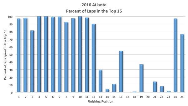
The problem with this is that it’s useless in terms of information. It doesn’t provide much statistical discrimination.
Let’s say I write an exam for a class and I make it really, really easy. I have a problem after I grade it because everyone in the class did very well on it. I can’t use simple questions to separate those students who really understand the material and can apply it to tough situations from those who only know the basics.
In other words, I didn’t ask the right questions. And that’s the problem with this graph. All it tells me is that the drivers who ran in the top 12 pretty much stayed there the whole time. It doesn’t give me any information to separate out those drivers.
It looked for a moment that I might learn something about the 3rd place driver, Kyle Busch, who was only in the top 15 for a little over 80% of the time. There’s a reason: he failed post-qualifying inspection and started dead last. If you look at how his position changed over the race…
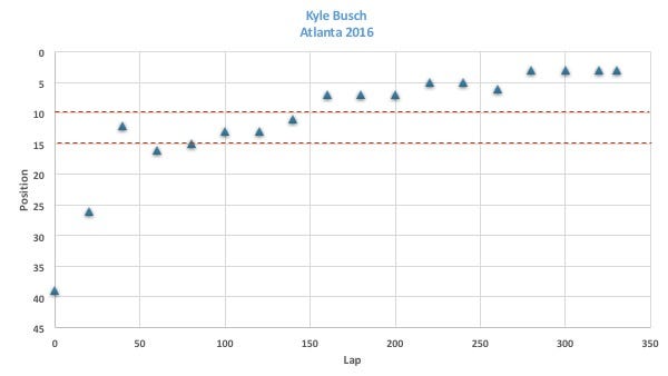
It took him forty laps to make it into the top 15, then he climbed steadily the rest of the race. Once he made it into the top fifteen, he didn’t leave. In fact, he ran more than half the race in the top ten.
So much for that idea.
Ran = Laps Led
Well, I won’t bore you with the other things I tried, but I finally settle on laps led as a way to measure how someone ran. I’m using the percent of the laps led, so if someone led the entire race, it would be 100%. If they led 250 laps for a 500-lap race, it would be 50%.
Running as Well as You Finish
It would seem that the driver who leads the most laps ought to be the best driver and thus win the race, right? Here’s a plot of the percentage of laps led versus finish for Phoenix.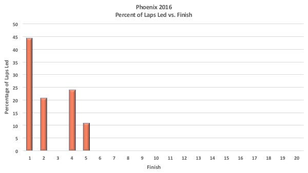
The first place driver led the most laps (44%). The second and fourth place driver led 21% and 24% respectively. But the third place driver didn’t lead any laps. What was going on there? Well, the third place driver was Denny Hamlin. he started well and stayed in the top five…
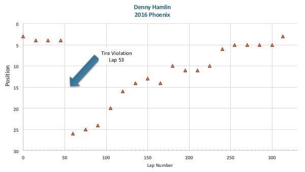
…until a tire violation on lap 53. Then he had to go to the tail end of the line. He spent the rest of the race making his way back to the front and never led any more laps. He had a good car, but the pit-stop problem kept him back in the field trying to recover for most of the race. So perhaps he didn’t finish as well as he ran.
You can see an extreme case of finishing how they ran in the Xfinity race in Phoenix (or, frankly, most Xfinity races Kyle Busch runs).
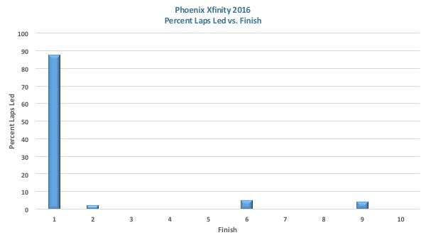
This is what domination looks like graphically. Kyle led 87% of the laps. Three other drivers accounted for the other 13% of the laps.
Running Better than you Finish
Now let’s go back to Atlanta and look at the Laps Led data to find an example of running better than you finish.
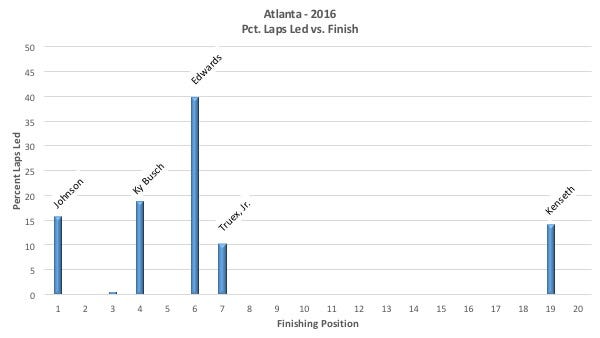
Carl Edwards led the most laps (40%) only finished 6th. The lap-by-lap data shows no penalties. He ran in the top 8 for the entire race, but just couldn’t get past the other cars. Same thing for Martin Truex, Jr. who led 10% of the laps and finished 7th, with no penalties.
Not the case for Kenseth, who was running well the whole race, but got a safety violation at last 117 and was never able to fight his way back to the front.
Caveat: You have to realize that this level of analysis won’t be able to tell whether someone who finished 14th really should’ve finished 12th. If you didn’t lead any laps, this analysis will tell us absolutely nothing. But it will highlight the more extreme cases.
Data! I Need More Data!
The problem with individual races is that we’re talking about very small amounts of data. You may have five drivers who lead laps and there may be extenuating circumstances. So what if you look at the season as a whole? Instead of plotting versus finish, I’m plotting vs. ranking because in the end, that’s what’s going to matter in terms of a championship season.
Let’s look at the data by itself first.
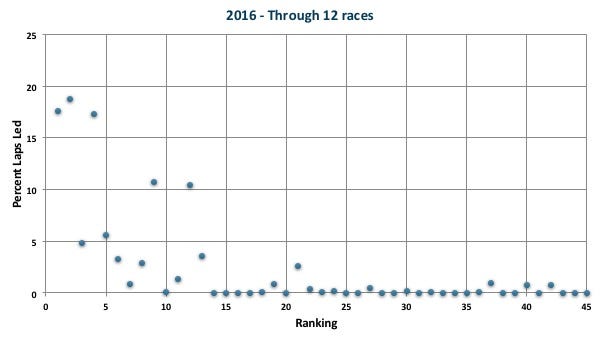
We know that the ‘best’ drivers should lead the most laps and that the drivers at the bottom probably won’t lead any laps, so the shape of the data shouldn’t surprise us. In fact, we can eyeball a curve that goes through most of the points (a best-fit line).
Now if I were doing a formal statistical analysis, I’d find a mathematical model and do a non-linear least squares fit to the data.
In this case, thought, I eyeballed it because I doubt that the precision of the results would justify the amount of time I’d need to do all of the above. You have to be careful when you do this because it’s easy to see what you want to see. I think, however, that this is a defensible choice.
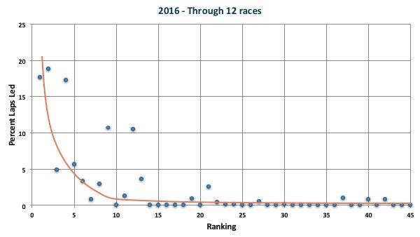
What we’re interested in is the position of each point relative to where our line predicts it ought to be. Most of the points are pretty close to the line, but a couple definitely stand out because they are much further away from the line than the others.
BEFORE YOU LOOK AT THE NEXT GRAPH…
If you haven’t done it, name the top four drivers you’d say have been running better than they finished for the entire season? OK. Now you can look.
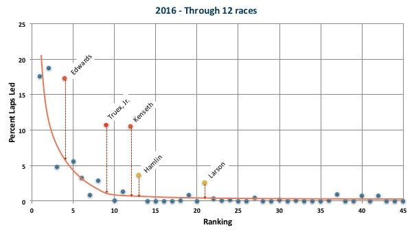
I think this data does support the idea that Edwards, Truex, Jr. and Kenseth (and to a lesser extent, Hamlin and Larson) have been running better than they finish this year.
Refining the Definition of “Running”
If we’re going to claim that these drivers are ‘running better than they finished’, we have to try to see if we can understand the reasons why. One of the things that ruin races are penalties. I separated the penalties for these drivers into driver error and team error. Basically, speeding and commitment line violations are pretty much attributable to the driver and everything else (too many men over the wall, tire violations, etc.), I blamed on the team.
For most drivers, the penalties seem to be fairly equally divided between driver and team. I realize that if someone screws up the digital dash and the driver speeds because his dash is giving him incorrect information that it is not the driver’s fault — but it’s also pretty impossible to tease that out of the data (and time) I have.
I think there’s the hint of a correlation between how many penalties and where you’re running/finishing. Kenseth, Edwards and Truex, Jr. really didn’t have many penalties this year (3–4). Hamlin (11) and Larson (13), on the other hand, have had much more than their share of penalties and that may account for why they are ranked lower.
This raises an interesting question. We always hear that racing is a team sport, but when you talk about ‘running’, are you talking about how the driver is running or do you include the team in that? If a team makes a lot of errors and screws their own finishes, can you really saw they ran better than they finished?
If that’s true, I suspect we throw out Hamlin and Larson because their errors may be responsible for their lack of good finishes. I suspect there’s more to this penalty business, but that is going to be a question for another day.
Please help me publish my next book!
The Physics of NASCAR is 15 years old. One component in getting a book deal is a healthy subscriber list. I promise not to send more than two emails per month and will never sell your information to anyone.
Discover more from Building Speed
Subscribe to get the latest posts sent to your email.
Be the first to comment